
Considering how often we have to fill out forms, it’s not surprising that we don’t enjoy it much. Filling out forms doesn’t give us the same dopamine hit that tapping a button does. And multiple studies show that the more complex the form, the less likely a user is to complete it.
The Peak-End Rule states that users tend to evaluate an experience based on its peak (the most complex moment) and the end — often, both moments are the form. And so it should come as no surprise that when we talk about optimizing the UX (User Experience) of a website or app, we often focus on the UX of forms.
Despite the resources poured into the field, there is no one-size-fits-all approach. Every form is geared towards different customers and should be treated as a unique challenge. That said, there are best practices that normally apply.
Simplify, And Then Simplify Some More
The simpler your form, the more likely a user will complete it.
Simple forms use single columns, with labels to the left or above each field. Break forms down into sections with related inputs grouped together. You should pay serious attention to UI (User Interface) guidelines that ensure legibility and predictable interaction.
As a bonus, the simpler a form is, the easier it is to fill out on mobile, which for many businesses is now the primary source of traffic.
Above all else, forms should be stripped of any input fields that are not essential. Certainly, we would all like to know more about our customers, but every field you add increases the likelihood of customers abandoning the form.
Don’t Make The User Work
Once our forms are as simple as possible, we can still do more to encourage our users to complete them. The web possesses a wonderfully rich set of technologies, and there is no reason for your customer to do any of the heavy lifting.
Ensure that every field uses a semantically correct input field. This will assist mobile browsers in supplying the user with the correct keyboard. Also, ensure that your form works with browser auto-complete features — some designers opt to use placeholder text as labels, which is confusing when your browser fills out the form because it instantly obscures every label.
Forms are also a prime example of the principle that accessibility benefits us all — most keyboard users will tab through form fields rather than select the next field with their cursor.
We can also improve the UX of forms on the backend. For example, many forms separate a telephone number into multiple fields: a checkbox to indicate a cell number or landline, an area code, and the telephone number itself. Not only does this play havoc with browsers’ auto-fill features, but it triples the work for the user and increases form abandonment.
However, data like telephone numbers follow standard formats. It is a relatively simple task to format data on the backend of your site, removing non-numeric characters and detecting and automatically splitting the area code and number. By approaching the data this way, you can use a single input field and still store the data in a format that suits your business.
Generally, anything that you can do to reduce the user’s workload is worth doing. Even minor improvements could mean retaining more customers and more business.
Reduce The Perception Of Work
There are times when we cannot simplify forms. Sometimes, we really do need a telephone number in addition to an email address. If we can’t reduce the complexity of a form, then we can at least reduce the perception of complexity.
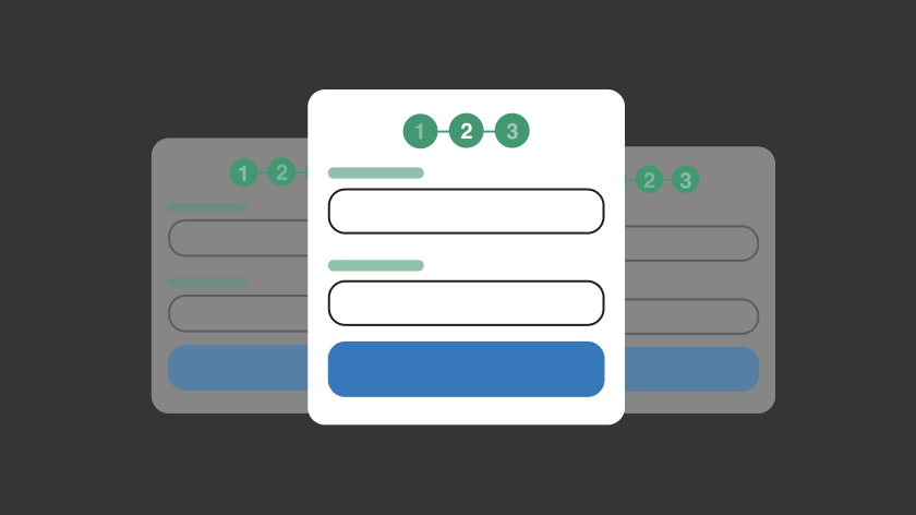
The best way to reduce the perception of work is to break your form down into a multi-step process. A multi-step form compartmentalizes a large number of inputs into different screens. For instance, the last time you made an online purchase, you probably entered your payment details on a different screen than your delivery details; that is a multi-step form.
Multi-step forms are less overwhelming than monumental forms with dozens or even hundreds of fields. They work best with a progress bar to indicate how complete the whole form is.
Multi-step forms also tie in with a critical UX concept: the Goal-Gradient Effect theorizes that users are more likely to complete a goal the closer they are to it. By designing multiple, manageable goals, a user is more likely to try and meet them.
All of the evidence indicates that multi-step forms, when designed well, are the best approach to complex forms. But on the web, there is always an exception…
Forms Are For Users, Not Businesses
We recently worked with a great client that uses a digital form to process very complex data. We were tasked with redesigning the form that used dozens of fields to enable a highly tailored service.
Our design team set to work, applying all of the UI and UX principles that benefit complex forms. We simplified the inputs to reduce complexity, cleaned up the visual design so that it was clear and compelling, restructured the fields to group related items, and reinforced the original multi-step process with a beautifully designed UI to guide users through the stages.
Our client was delighted with the final designs, so we built a working prototype to test first with our staff, then the client’s staff. All went well. After some minor tweaks, we began user testing with real customers, and that’s when disaster struck…the customers disliked it!
At first, we were baffled; we’d applied best practices throughout, and internal testing showed it to be a vast improvement on the original form. So we doubled down on user testing and began interviewing customers about their experience, and that’s when we cracked the problem.
Despite being intended as the final step in a process, some customers wanted to use the form differently. Often, all of the business data required by the form became available at different times. As a result, customers were entering different chunks of data when they had them and filling out the form over multiple sessions.
Contrary to the received wisdom, in this case, the multi-step form made it difficult to quickly review and edit what had already been entered and complicated the validation logic.
Thanks to proper user testing, we were able to understand our client’s customers and prove that, in this particular instance, a multi-step form was more of a hindrance than a help.
We converted the form to a single scrollable form, with sections visually grouped, and helped our client build a better understanding of its customers.
It’s common for companies to structure forms around business needs; after all, a form typically initiates a business process. However, your customers, not your business, will be using the form, and it must serve their needs if you want to increase completion rates.
Test, And Then Test Some More
Forms are one of the deepest and most important interactions you can have with your customers. We frequently talk about the importance of UX testing, and it is never more critical than for forms.
Many case studies have been carried out in the last few decades that have resulted in well-established best practices for form design. The sheer volume of evidence supporting those principles means that, in many cases, UX testing will simply validate the design team’s expectations.
However, experience tells us that every project is different. By diligently testing our work, we can provide fresh insights into our clients’ customers and uncover new opportunities to improve CX (Customer Experience).
