Dashboards often provide that meaning: windows into large datasets that help us bridge the gap between knowing and understanding.
Operational dashboards are functional, letting users carry out actions immediately. Analytical dashboards offer insights, helping users understand the trends within datasets. Strategic dashboards blend the two, enabling users to find meaning in data and plan actions based on different outcomes.
When designing a dashboard, there are three principle decisions to bear in mind: What is it that you’re measuring, what might a user’s end-goals be? How is the data framed, what should be included and excluded? What data should be highlighted, how can you editorialize constructively?
To answer those questions, it’s essential that you understand your users, the potential of the data, and what interactions add value.
Highlight Change To Trigger Decision Making
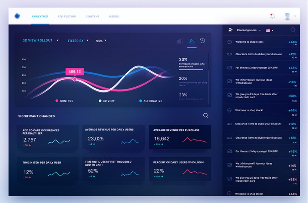
Data has to be understood in context to be helpful in a decision-making process. Context transforms core data into valuable insights and allows us to comprehend not just simple numbers but also the underlying relationships.
Users do not take action based on the current status of the dashboard; they take action on a change. Whether it’s a dip in the exchange rate, an increase in bookings, a variation in turnover, it is a change of status that prompts user action.
Stability may seem reassuring, but in fact, a lack of change is paralyzing and renders decision-making all but impossible.
By highlighting change, no matter how small, we empower users to make decisions and actively improve their situation.
Prioritize Decision-Critical Data
The human brain excels at fast processing. Human cognition, encompassing memory, reasoning, learning, logic, and everything else required for decision-making, is supremely fast.
But the human brain is also finite, and it has to make up for this speed elsewhere. It makes up for it with slow memory recall. It’s a little like buying a new laptop and sacrificing some RAM so you can afford a better processor.
Human brains give greater weight — often unfairly — to information currently in front of them than information that is remembered.
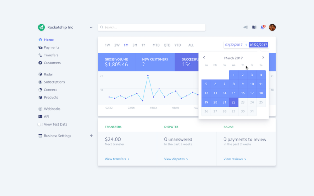
For a dashboard to enable effective decision-making, everything critical for the decision at hand should be visible on screen. Users shouldn’t have to recall information from a different screen, and they shouldn’t have to scroll or tap. Decisions will be made based on what is immediately in front of the user, so all vital information must be visible.
Single pages create better engagement precisely because they enable singular decisions based on the information in front of a user.
Handle Errors Gracefully To Boost Confidence
In an ideal world, we would design systems that were entirely error-free. Unfortunately, however, no system is foolproof, and errors will occur.
Sensible handling alleviates encountered errors. When handled gracefully, errors can even boost a user’s confidence in a system — it’s far easier to scale a rock face if you know there’s a safety line to catch you if you fall.
UX writing plays a large part in averting errors. Carefully written UI copy, such as intelligently written accept and cancel buttons, ensure a user doesn’t need to rely on trial and error to proceed. Any error messages should be in plain language, not developer-speak. Allow the user to undo actions. And for critical interactions like transferring money, always verify consent by asking the user, “Are you sure?”
Rigorously Apply Order To Your Data
Abundant data is a good thing, provided that you can make sense of it. However, confusing an interface with too much data leads to choice paralysis, where a user is so overwhelmed by options that they fail to make a decision at all.
You can apply Gestalt principles to clarify data; proximity, similarity enclosure, continuity, and connection are visual tricks to group data together.
Generous whitespace is also beneficial for large volumes of data; whitespace is where the eye retreats to make a decision.
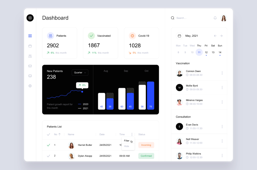
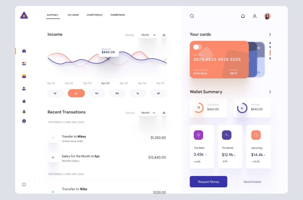
Charts are a common element of many dashboards, and selecting the correct type of chart is essential. For example, a pie chart is difficult to read because the human eye is poor at comparing surface areas. On the other hand, line charts or bar charts convey data accurately.
Accelerate Adoption With Real-World Concepts
A good dashboard is an extension of the user’s will. In time, the user should cease to see the interactions and instead see the functions themselves.
By matching a dashboard to real-world concepts, we can build a dashboard that is immediately familiar and easy to adopt. That’s not to say dashboards should be skeuomorphic — in fact, aesthetically speaking, minimalism is the preferred style for dashboards — but rather that real-world concepts help users see through the interface to the data underneath.
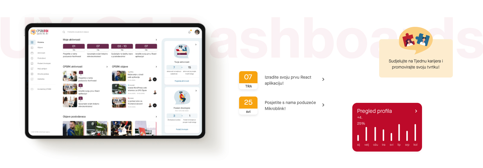
Cards work well in dashboards. These chunks of data can be presented as micro-dashboards within a larger whole. Sites position menus top-right because that is where we learned to turn a page in the real world. Cards can adopt the same learned interaction by placing their menu options in the top right.
Personalization is Empowering
The default user journey on a dashboard should always be simple. In an ideal design, onboarding is unnecessary because the interface itself is self-explanatory.
Beyond the default user journey, shortcuts allow power users to supercharge their interactions. Inserting shortcuts means that a single dashboard suits both novices and experts and will continue to succeed as user expectations grow.
Many dashboards offer customization — making changes to the UI based on manual settings — but a more robust route is personalization. Personalization adapts to the user’s history of interactions to create an individual experience.
For example, dashboards tend to place the essential information in the top left of a screen because Western languages are read (left-to-right, top-to-bottom). However, for readers of right-to-left languages, it is more natural for primary data to be top right, and it’s a simple process to flip a dashboard for users on RTL languages.
A good dashboard guides users from novice to pro by exposing shortcuts and offering customization; a great dashboard does it through personalization, without the user noticing.
Empowering Users With Dashboards
The most crucial aspect of any dashboard is showing the user the current situation. Every good dashboard first orientates the user with their current status before introducing more nuanced data.
Presenting data in context, particularly when focussed on changes in the dataset, empowers users to make effective decisions.
By personalizing a dashboard and exposing shortcuts for power users, we can design systems that support and affirm a user’s end goals.
